Utility Warehouse
Digital reBrand

Overview
The Utility Warehouse (UW) rebrand is a strategic transformation that went hand in hand with the updated brand strategy, it set out to unify it’s visual identity, and enhance customer experience. As Digital Design Lead, my role was to architect and lead the digital exploration of a compelling, consistent digital brand across all touch points — including web, email, display ads, iconography, animations, photography, and reusable component libraries, working closely with various departments throughout the company such UX/UI, product and marketing
This transformation not only strengthens the company’s identity but also builds scalable foundations for experimentation, speed, and consistency across cross-functional teams.
Process & Approach
1. Discovery & Audit
A comprehensive audit of digital assets to identify inconsistencies in visual style, interaction patterns, and messaging.
I collaborated with team member's, marketing, product, and engineering teams to define user needs and business goals.
Evaluated how brand elements (e.g., visuals, typography, imagery, motion) currently manifest across digital channels.
2. Brand Design System Development
Collaborated on the creation and documentation of a robust digital design system including UI components, icons, motion principles, and reusable layout patterns.
Integration of engaging assets and systems — including photography, icons and motion design — into design foundations that can flex across hierarchy of narrative journeys.
Working with UX team to ensure accessibility, responsiveness, and brand alignment are core to the system's structure.
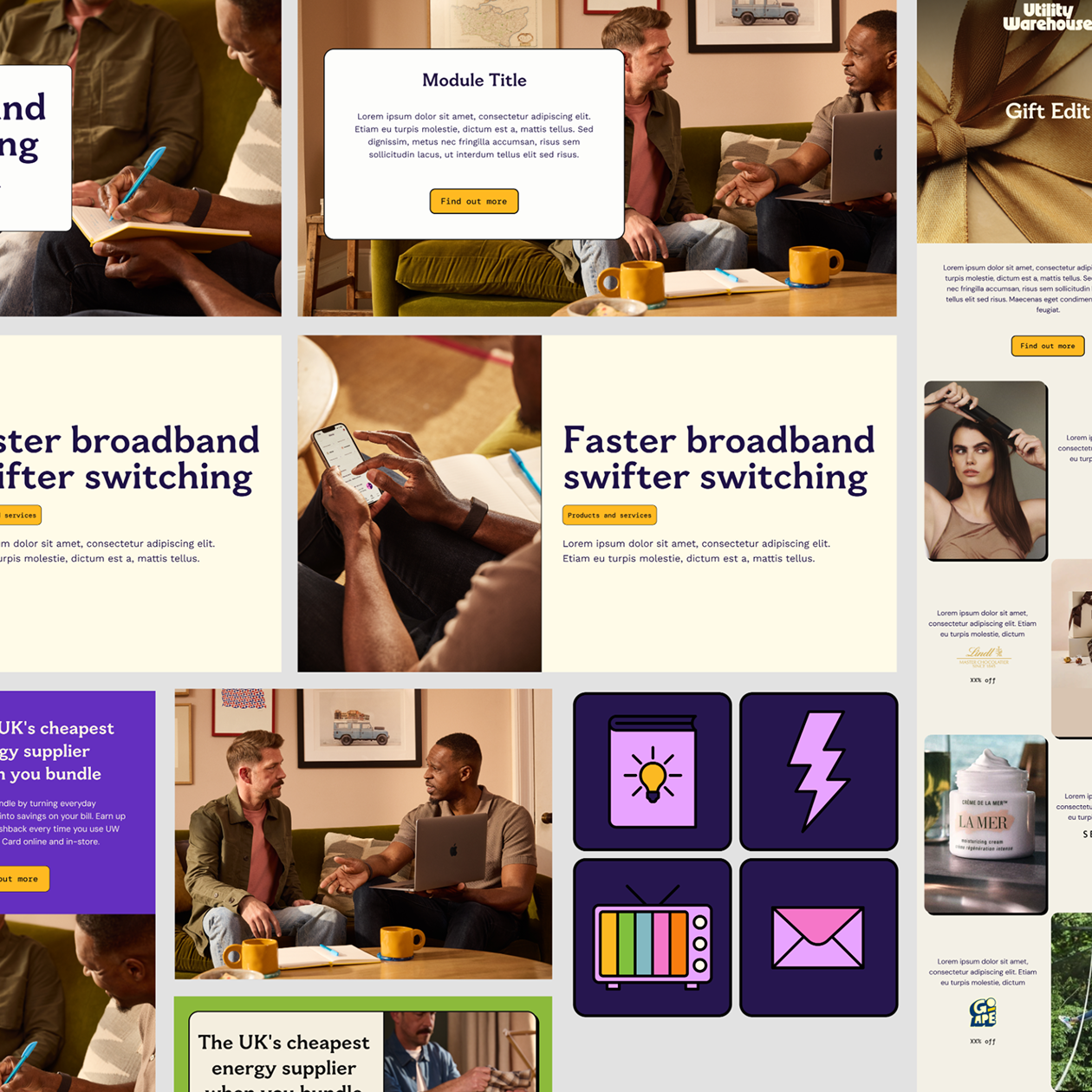
Web UI Component variant exploration
Documenting variant component iterations of brand
application to the
CMS web platform, setting the
adaptable structure of the design system
Web template iteration exploration
Documenting variant layouts and how modules will
interact with each other in terms of information and narrative hierarchy.
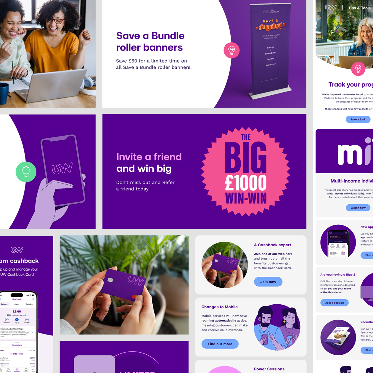
Email new structure
New rebrand gave opportunity to restructure
templates according to user and product owner needs
Update Iconography
Along with new email structure, it gave the ideal platform to stress test developing iconography
3. Cross-Channel Implementation
Web: Redesign high-visibility user journeys and page templates using systemised components for speed, consistency, and performance.
Email: Build out modular design blocks and reusable templates that are brand-aligned, mobile-optimised, and flexible for marketing and operational use.
Display & Paid Media: Create frameworks for scalable creative — incorporating brand visuals, messaging, and animation guidelines that ensure continuity and recognition.
Apply brand principles to visual storytelling elements such as photography and iconography, within the system, ensuring human-centricity, clarity, and emotional resonance across all channels.

4. Collaboration & Enablement
Worked closely with internal teams to embed the design system into workflows and tools.
Through collaboration provided guidance, documentation, and design QA processes to ensure consistency in implementation across teams.
Champion a culture of experimentation, using the system as a stable foundation from which teams can test, learn, and iterate safely.