Comparison Cards
Avios
Project Overview
Customer research identified that users were not always aware of the different ways they could purchase Avios. The challenge was to make the wider product portfolio easier to discover, understand, and compare, while supporting more confident purchase decisions and creating opportunities for upsell.
Process & Approach
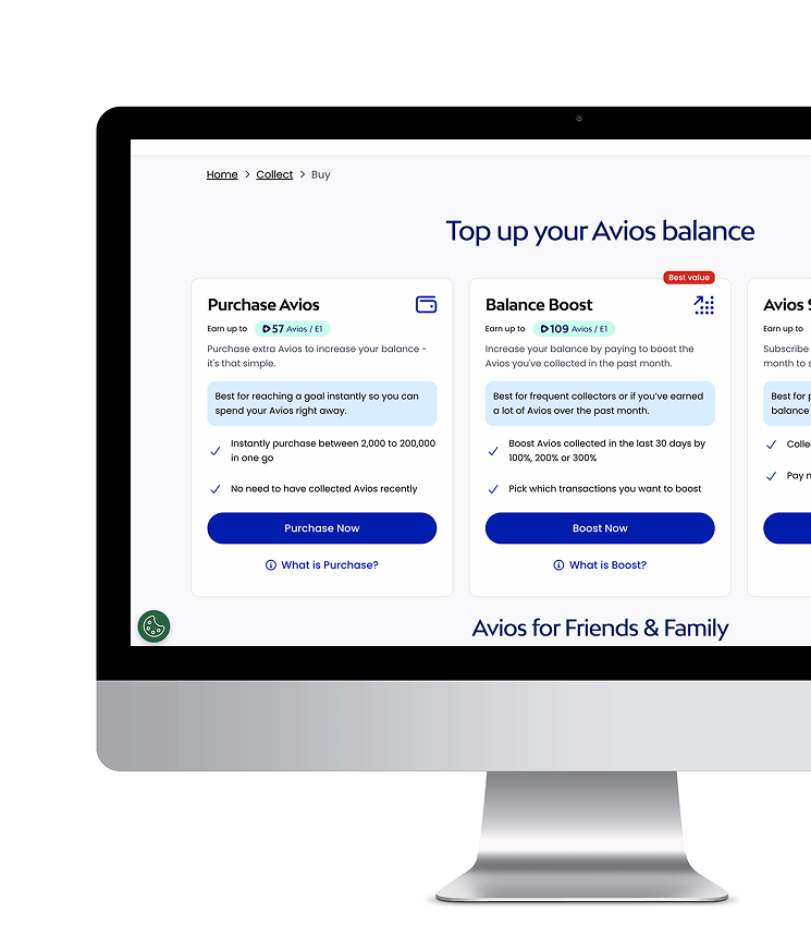
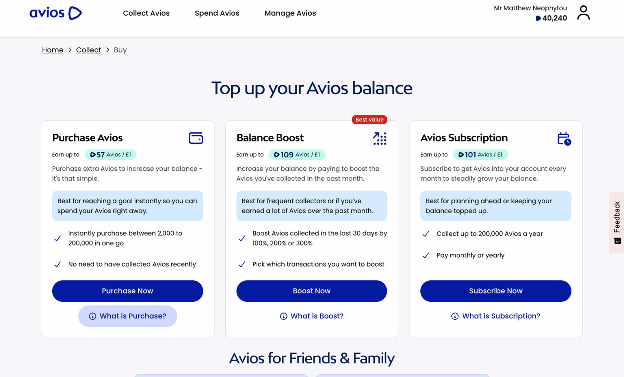
Insights from customer research shifted the direction from a recommendation-led tool to an education and comparison-led experience. I designed interactive comparison cards to surface key product benefits and differences, using progressive disclosure, supporting content, iconography, and step-by-step guidance to reduce cognitive load and make complex information easier to understand.
Outcome & Impact
The new experience shifted the product from recommendation-led to education-led, helping customers discover and understand the wider range of Avios purchase options.
The comparison cards and progressive disclosure created a clearer, reusable pattern for explaining product differences, supporting future optimisation and upsell opportunities.
While quantitative performance data wasn't available for the project, the key outcome was a change in product direction based on customer insight.
User Insights
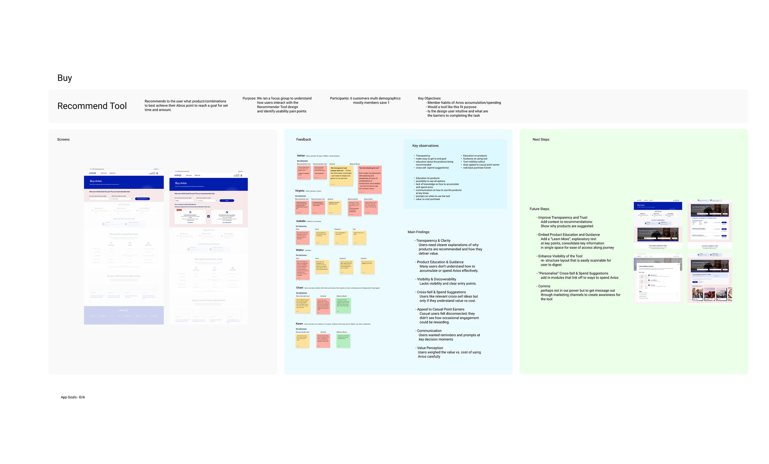
The research was documented to capture the purpose of the study, participant details, and key research objectives. I compiled the prototype screens alongside user feedback, identifying recurring themes, pain points, and opportunities for improvement. These findings were then translated into actionable next steps, ensuring design decisions were grounded in user needs and validated insights.
Comparison Card pivot
Following the user research, the project pivoted from a recommendation-focused experience to one centred on education. Working closely with the Product Owner and Content team, I designed comparison cards that highlighted the key features and benefits of each Avios buying product, making it easier for users to understand the differences at a glance.
“What is it?”
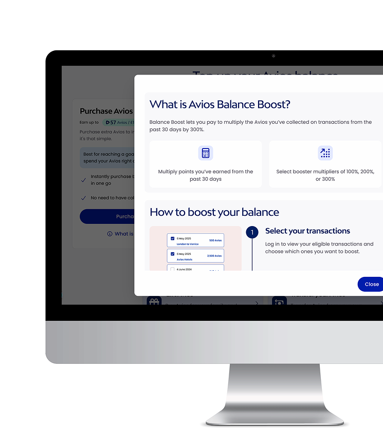
I also introduced a "What is it?" secondary call-to-action, which opened a detailed view of each product, providing additional context, eligibility information, and a visual walkthrough of how to claim or purchase Avios. By incorporating clear iconography and image-led step-by-step guidance, the content became easier to digest, reducing cognitive load and helping users quickly understand each option. This gave users the knowledge and confidence to make informed decisions while increasing awareness of the full range of Avios buying products.
What I learned?
The project reinforced the value of allowing research to challenge the original brief. The initial assumption was that customers primarily needed help choosing a product; the research showed that many first needed help understanding what the products were and how they differed.
For me, this highlighted an important Product Design principle: sometimes the best solution isn't to make the existing journey more efficient, but to reconsider what the user needs before that journey can succeed.